Sarthak Dev Studio V2
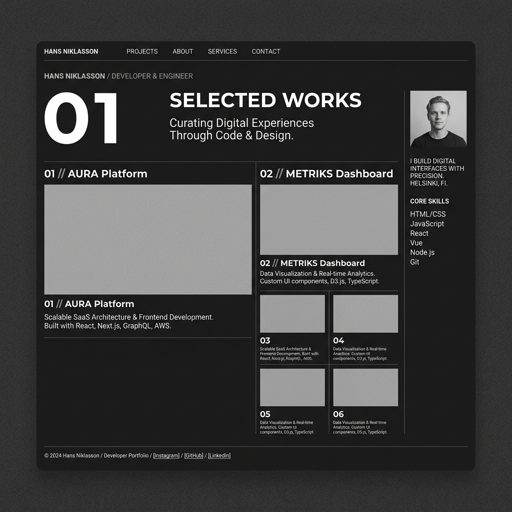
Visit Live SiteThe website you're currently viewing. Designed as a personal brand platform rather than a portfolio, it uses Swiss editorial design principles, monochrome aesthetics, and intentional typography to communicate the Developer → Builder → Future Founder narrative.
02 // Overview & Problem
The Situation
Most developer portfolios follow a predictable template: Hero, About, Skills, Projects, Contact. This project rejects that pattern entirely. Instead, it's built as a storytelling platform that guides visitors through a narrative about technical capability, product thinking, and builder mentality.
The Core Challenge
Generic developer portfolios fail to differentiate. Skill bars and project grids communicate nothing about how a developer thinks, why they build, or what problems they solve. The challenge was creating a digital presence that feels closer to a technology studio than a personal resume.
03 // Strategy & Approach
Insights & Discovery
Studied Swiss editorial design, luxury technology brand presentations, and creative engineering studio websites. Analyzed how typography hierarchy alone can create visual impact without relying on color or effects.
Architectural Blueprint
Monochrome-only color system. Instrument Serif for editorial impact. Inter for readability. Every section answers a specific question about the developer behind the work. Content architecture follows a deliberate storytelling flow rather than an information dump.
04 // Implementation & Hurdles
Execution & Build
Built on Next.js 16 with the App Router. Lenis provides smooth scrolling. Framer Motion handles scroll-triggered reveals. The design system uses CSS custom properties for consistency. Project data is centralized for easy content updates.
Technical Bottlenecks
Restraint was the hardest part. The temptation to add color, effects, and visual complexity was constant. Every design decision was filtered through the question: does this support the narrative, or does it distract from it?
05 // Outcome & Lessons
Final Deliverable Impact
A website that communicates technical depth through design intentionality. Visitors engage with the thinking behind the work, not just screenshots of finished products.
Key Takeaways
Less is almost always more. A monochrome palette forces every element to earn its place. Typography can carry an entire design when treated as a primary visual element rather than a container for content.
06 // Technical Specifications
07 // Roadmap & Next Steps
Adding a blog section for technical writing, implementing dark/light mode toggle, and building a project metrics dashboard.